Around the Color Wheel
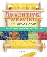
When it comes to weaving, applying a little bit of color theory can be the ticket to eye-catching results. Brush up on some basics with this excerpt from Inventive Weaving on a Little Loom.
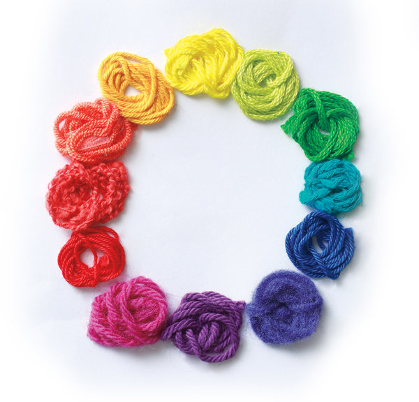
One of the first things you notice about a textile is its color. A garment can be beautifully woven and masterfully tailored, but if it’s the wrong color, it can be hard to look at. Picking the right color or set of colors is important.
This is the point where some weavers get stuck. Color is so subjective and such a large factor in a textile’s success that they freeze up and become afraid to combine colors for fear of weaving something that clashes. Adding to the danger is the way color works in weaving, combining like pixels in a pointillist painting to create new colors, some of them wonderful, others dreadful.
Color Combinations
Color is often represented as a wheel of pure hues, but if you look at the world, you’ll notice most colors aren’t on the wheel. Really, color is more like a sphere with the color wheel at the equator and light colors at one pole, dark colors at the other. The interior of the color sphere is filled with innumerable color mixes.
Primary Colors
Primary colors that are used to mix paint, dye, or ink are red, yellow, and blue. All the other colors on the color wheel can be generated from these starting points.
Secondary Colors
Secondary colors are created by mixing together two of the primary colors. The secondary colors are purple, orange, and green.
Tertiary colors
Tertiary colors are created by mixing a primary and a secondary color: red-purple, red-orange, blue-green, yellow-green, yellow-orange, and blue-purple.
Triad
Three colors that are evenly spread around the color wheel form a triadic color scheme. Purple, orange, and green form a triadic color scheme. This creates a vivid color palette. One way to tone down a triadic color scheme is to adjust the proportions of colors so that one dominates and the other two are used as accent colors.
Analogous
Colors that are next to each other on the color wheel form an analogous color scheme. Blue-green, green, and yellow-green form one analogous color scheme. This combination is harmonious and rarely clashes. The downside to analogous color combinations is that their lack of visual tension can make them subdued and low energy.
Complementary
Colors on opposite sides of the color wheel, such as red and green, are the complement of each other. This combination creates a lot of visual tension, especially when the colors are used in the pure hue form.
Getting Color Proportions Right
There are many ways to put colors together. The simplest is to use equal amounts of each color in a scheme. Sometimes, however, this can cause too much visual contrast and/or create a too-predictable pattern. To break things up, you can change the proportions, or let one color lead and the others play subordinate roles as accents.
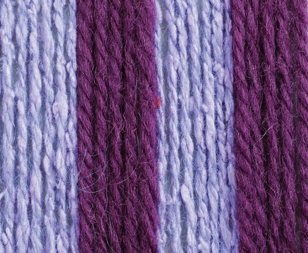
Many factors affect the visual strength of colors; bright colors come forward, dark colors recede. (This is because the reflective nature of the shiny threads makes them visually lighter than matte threads.) Thick threads come forward, thin threads recede. You can use these properties to create a color landscape that pleases you.
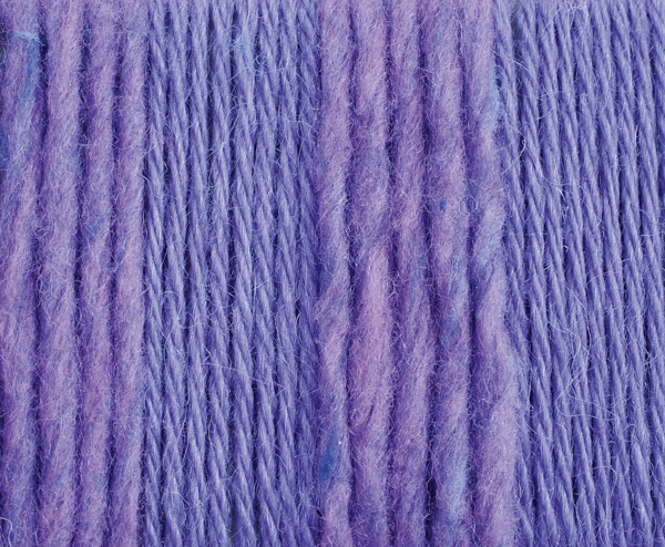
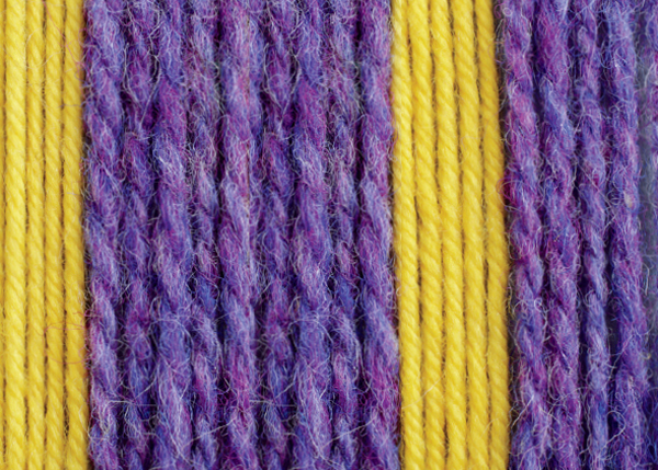
You know how some colors only work in small doses? Bright yellow, for example, is hard to take in large amounts. Yellow napkins on a table work, whereas a yellow tablecloth can be overwhelming. The property of colors was studied by Johann Wolfgang von Goethe, who developed a system by which he assigned a numerical value to colors to represent their relative strength. You can use his values as a way to balance the colors in a project. For example, if yellow (9) is three times as visually powerful as violet (3), you can use one-third as much yellow to violet in a fabric to make it more visually balanced.
EXCERPTED FROM INVENTIVE WEAVING ON A LITTLE LOOM © SYNE MITCHELL.


